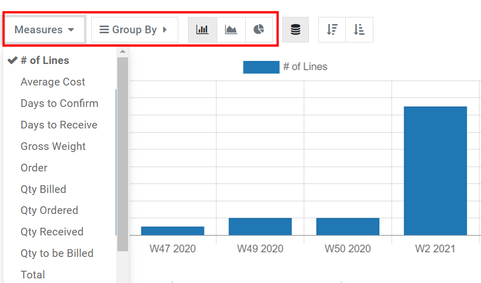
Visualize your data
You can transform the main graph in just a click by selecting one of the three charts: bar, line or pie. Fourteen different measures are available, but you can only use one at a time. However, you can group the measure using one or several of the 19 Groups.
For bar and line charts, the selected measure is your y-axis, and the first group you select is used to create the x-axis. Adding more group adds additional lines (line chart) or transforms your bar chart into a stacked bar chart. For pie charts, the more groups you select, the more slices are displayed.
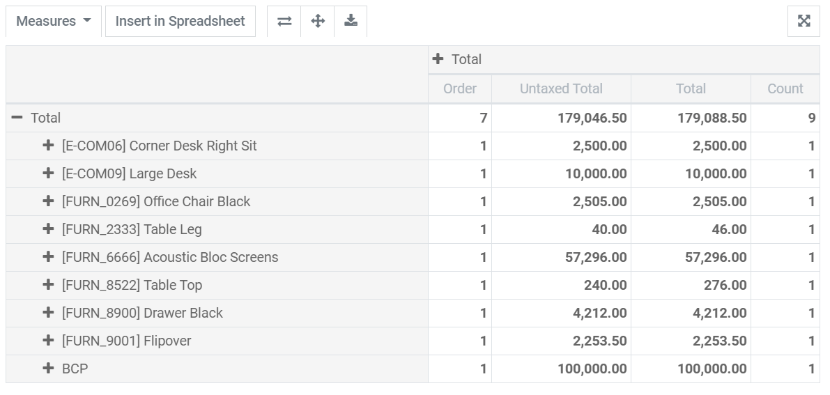
Explore your data
The pivot table view enables you to explore your data in great detail. Unlike the graph view, the pivot table enables you to add several measures at the same time. By clicking on Measures or on the + sign in the Total column, you can add as many as you want, each assigned to a new column. By clicking on the + sign in the Total row, you can add Groups. If you click on a group’s + sign, you can add a sub-group, and so on.
Tip
You can insert your pivot table’s data directly in the Spreadsheet app or export it as an Excel file